Topics regarding PureBDcraft, the HD cartoony resourcepack for Minecraft Java Edition.
BDcraft Web Admin
6615 Posts
x 437
Post
19 Jul 2013, 17:37
Sphax said he'd make a poll a while ago about the font, but he hasn't and I'm too curious to wait any more!
Which font do people prefer? The old or new?
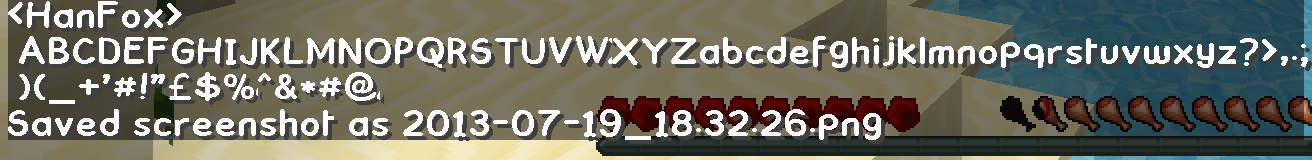
The below screenshots are just samplers, you only really get the real effect of them when chatting in-game.
Old - HD version of the vanilla Minecraft font
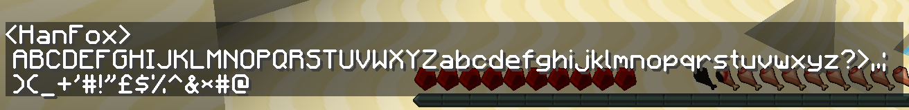 New
New -
Comick Book
If you like our work please consider becoming a
Supporter and get an ad-free experience.
Post
19 Jul 2013, 20:21
Your "new" looks so much better than mine. xD
I prefer the old, though.
"Cocoa Beans now grow on Jungle Logs!" - ThnxCya
Patch Creator
342 Posts
x 37
Post
20 Jul 2013, 02:06
If I had to pick between the two... I'd have to say that the old one is probably my more preferred one... only just, though. Frankly, I have no issue messing around inside the resource pack changing ascii files, as I usually go in there to pick alts and stuff anyway. About the actual fonts themselves, though, I think that both are fine, it's just that due to the style of the old letters, the pixels in those letters are slightly less visible (or at least it seems this way to me), and I've found myself being (only very slightly) irritated by the new one. That said, I still think the new one fits in with the pack, just fine, and in the end I am fine using either.
tl;dr: If one was creating a tally or something, my vote would be for the old font.
Post
20 Jul 2013, 15:02
Actually I quite like the new one, which shows more "comic" feel, as PureBDcraft is inspirated by comic. But the 'W' glitch is unbearable, and so annoying. So I pick the old one, which is more smooth and bugless than the new one.
"The most valuable things are the things that you get from your own sweat and hard work" - Prophet of Islam, Muhammad
Post
21 Jul 2013, 00:50
I really like the style of the new one.
But like fullspecs stated, it's really buggy.
The W glitch
IS unbearable, and it seems like it's supposed to be a ridged and old font whereas the old font is smooth and not jagged.

"Cocoa Beans now grow on Jungle Logs!" - ThnxCya
BDcraft Web Admin
6615 Posts
x 437
Post
21 Jul 2013, 01:18
Cocoa_Pod wrote:I really like the style of the new one.
But like fullspecs stated, it's really buggy.
The W glitch
IS unbearable, and it seems like it's supposed to be a ridged and old font whereas the old font is smooth and not jagged.
Had a fiddle and the W glitch only happens when I have Optifine enabled. So don't blame the texturepack for that it's the patcher's fault
 Show
Show
BDcraft Admin
578 Posts
x 20
Post
21 Jul 2013, 07:52
I think Optifine needs a config file to setup the width of each letter but I don't know how it is created...
If you like a post give it a diamond!

Have you tried
Cubik?
Post
21 Jul 2013, 15:37
It might be my version of OptiFine.
I'm currently using HD_U_B2 and HD_U_B4 just came out.
"Cocoa Beans now grow on Jungle Logs!" - ThnxCya
Post
22 Jul 2013, 14:49
I vote the old one.
An important factor when it comes to designing text elements is legibility. Although a typeface like the new one might suit a design with a hand-made comical aesthetic, using a typeface such as this for the chat system has a negative impact on the users. This is because it’s much harder to read than your average serif or sans-serif. When comparing the two fonts you will notice how much harder your brain has to work in order to make out the words in new font vs the old one.
I manually swap the fonts myself. Would be nice to have an option to download a pre-edited version for users without the know-how to edit the pack. I have had many players move away from this pack due to the font which is annoying because it changes the look of a build when people are using different packs.


